
Why this matters
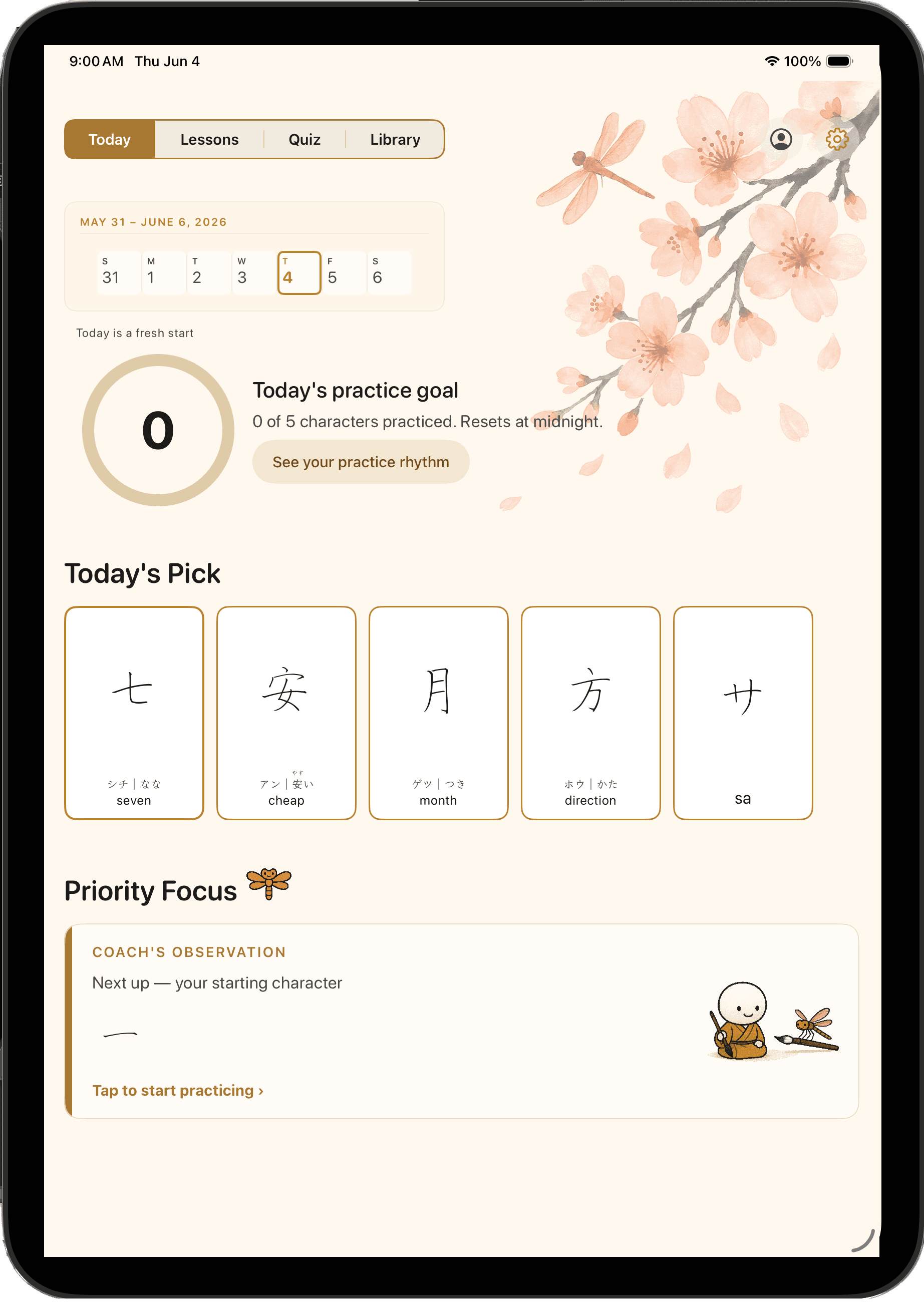
Most design leaders can direct a team; most people shipping solo with AI aren't design leaders. My value is the overlap: senior product judgment plus the operating model that makes AI agents produce real, shippable quality, so I deliver the output of a team at the cost of one.
NihonGo Ink is the proof. It's a technically real app (per-stroke handwriting grading, a hybrid on-device/cloud ML pipeline, offline-first), designed, built, and run entirely through a system I architected and lead.
How I built it without writing the code
I set up a structured multi-role team in Claude Code and ran it like an org: the agents execute against a clear spec; I do the leadership.
- The core team: Product Owner, iOS Developer, UX Designer, QA Engineer, UX Researcher, each with a defined brief. Specialists (tooling, review, growth, finance) pulled in ad hoc.
- The operating model: a single source of truth every agent decides against, explicit handoffs between agents, and a quality gate nothing merges without passing. This is the part I brought from a decade of running design orgs.
- Custom skills: project-specific Claude Code commands that formalize the repeated operations (sprint-preview authoring, code-review triage, premise verification, session-start orientation), so discipline holds under daily friction.
On a solo AI build, the bottleneck is whether someone is doing the job of a product owner and an engineering manager, not the model. That's the job I do.
The UX Researcher ran a competitive audit before a line of the design system was written — ten Japanese learning apps reviewed across writing interaction, feedback model, curriculum structure, and visual approach. It was one of many inputs into the product brief.
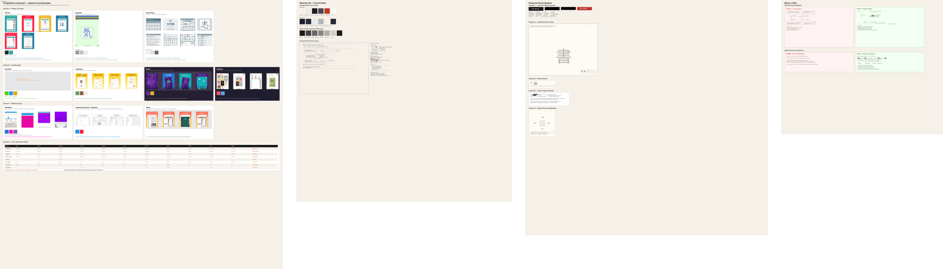
I also extended Figma into a programmable surface the agent team writes to directly, producing personas, competitive audits, and wireframes alongside the design system rather than stranding them in chat. And because character forms are immutable assets, I cleared commercial embedding licensing for a pen-kaisho typeface (the script class students learn to write, rendered in a pen-pressure style), so displayed character forms mirror how the strokes are produced.
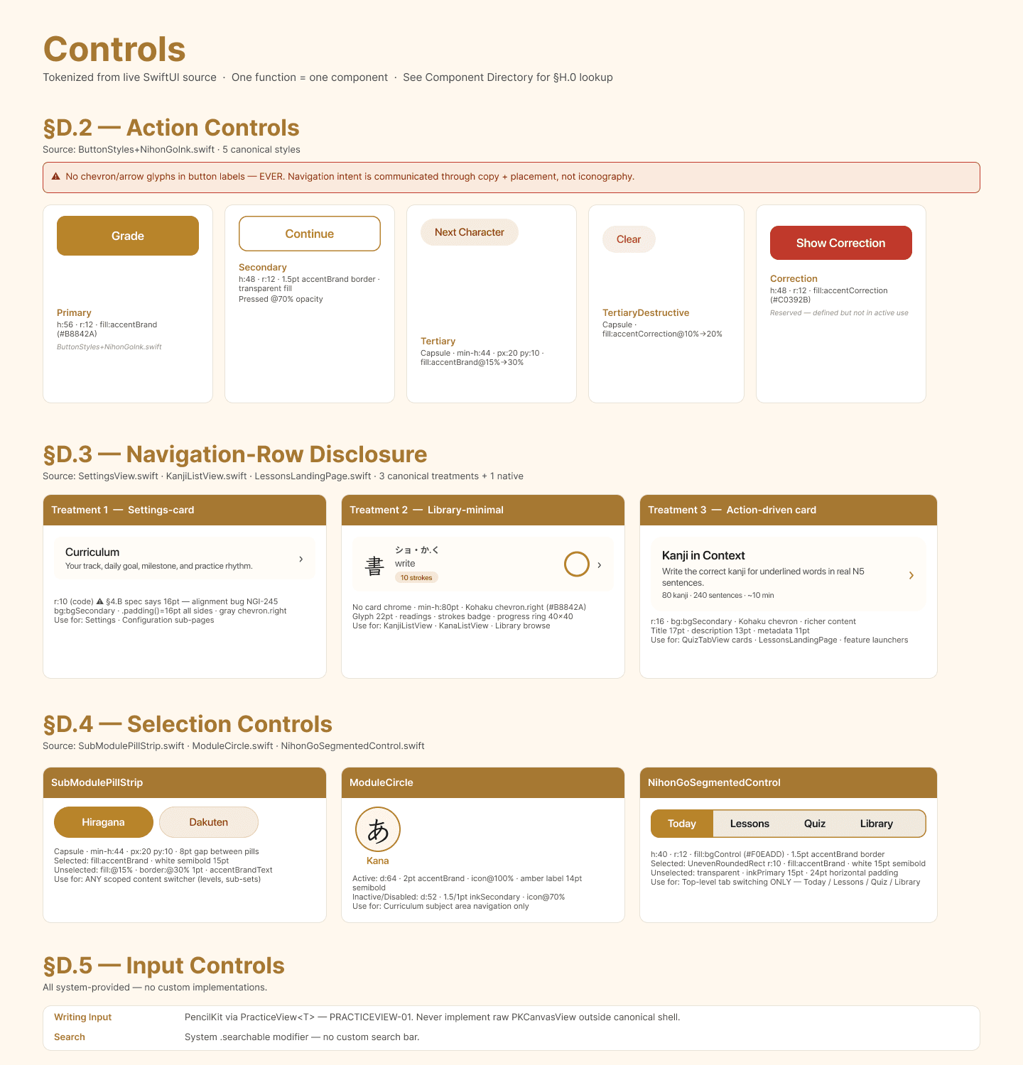
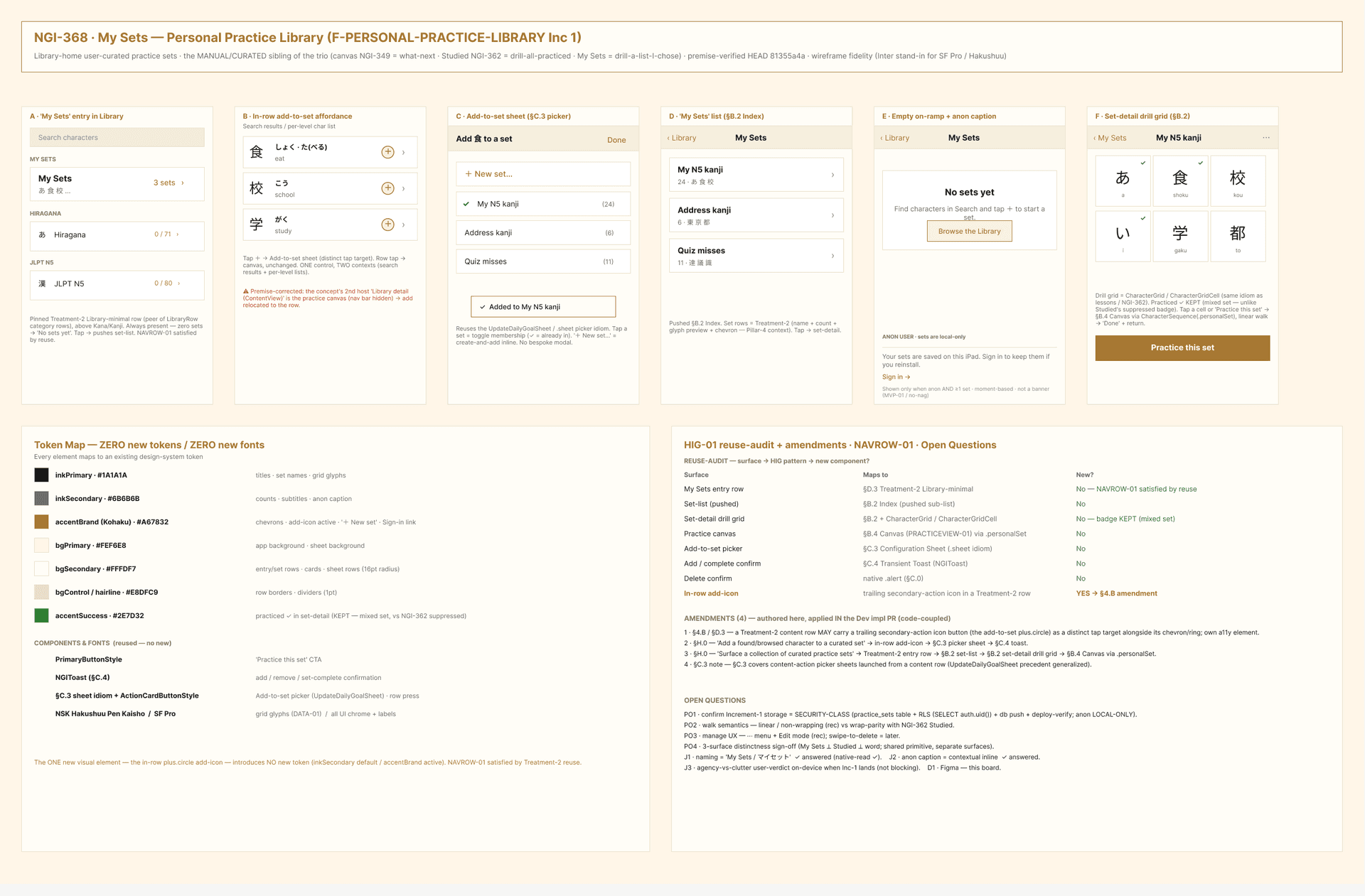
The UX Designer agent works against a full app Human Interface Guidelines — screen archetypes, overlay decision tables, control specs, spacing tokens — maintained in Figma alongside the design system. Agents cite the relevant HIG section in every PR. A PR using the wrong component is a bug, not a style difference.
The craft
NihonGo Ink teaches handwriting the way it's taught (correct stroke order, direction, and shape) for two audiences: Japanese learners studying for the JLPT proficiency exam and 美文字 (bimoji) practitioners improving everyday pen handwriting.
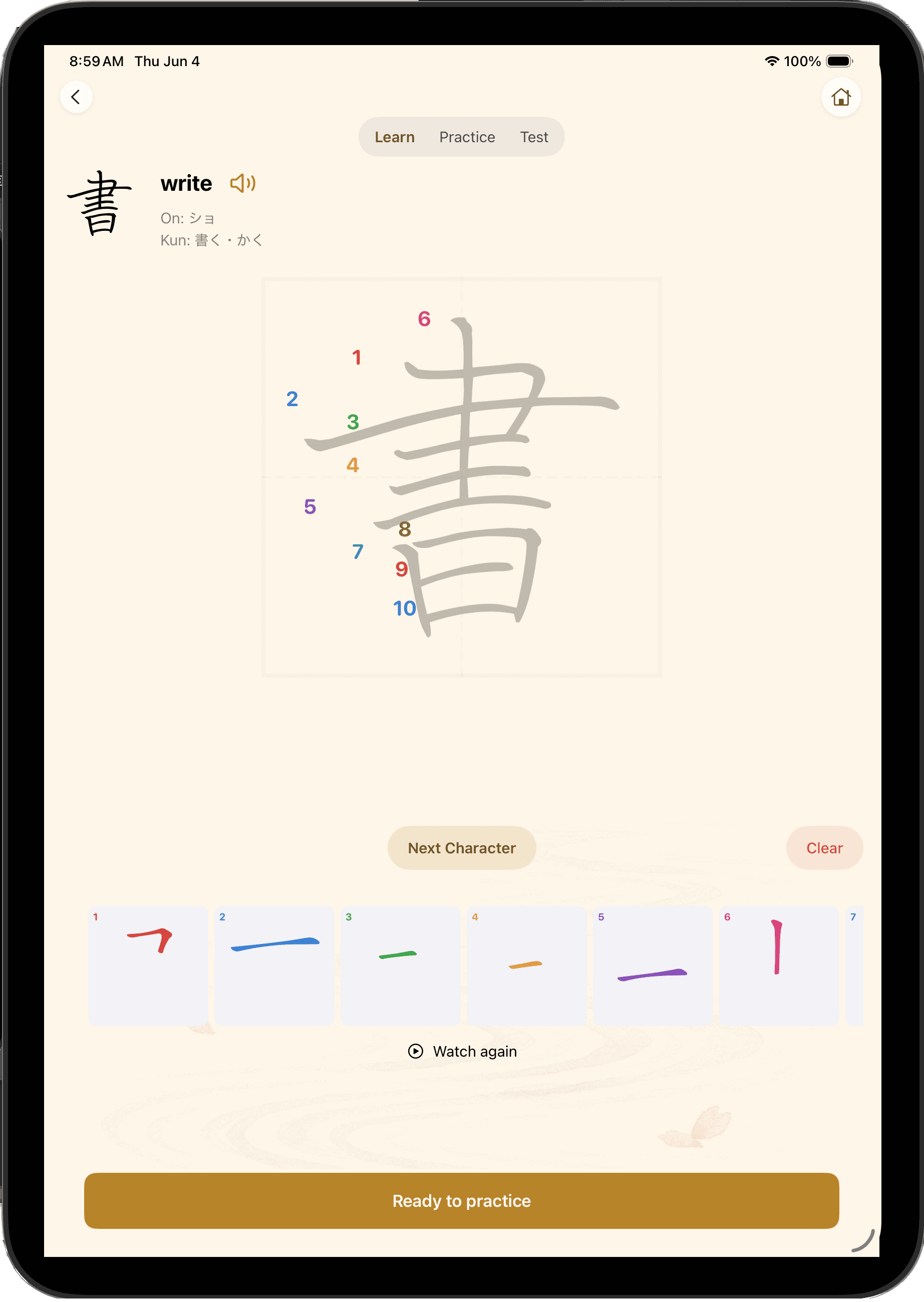
The core interaction is stroke feedback. Built on KanjiVG per-stroke geometry, the app scores individual strokes (shape, proportion, order, line quality) with per-attempt guidance instead of a binary pass/fail. Three modes (Learn → Practice → Test) remove support as mastery grows; Practice includes a worksheet view for multi-cell practice.
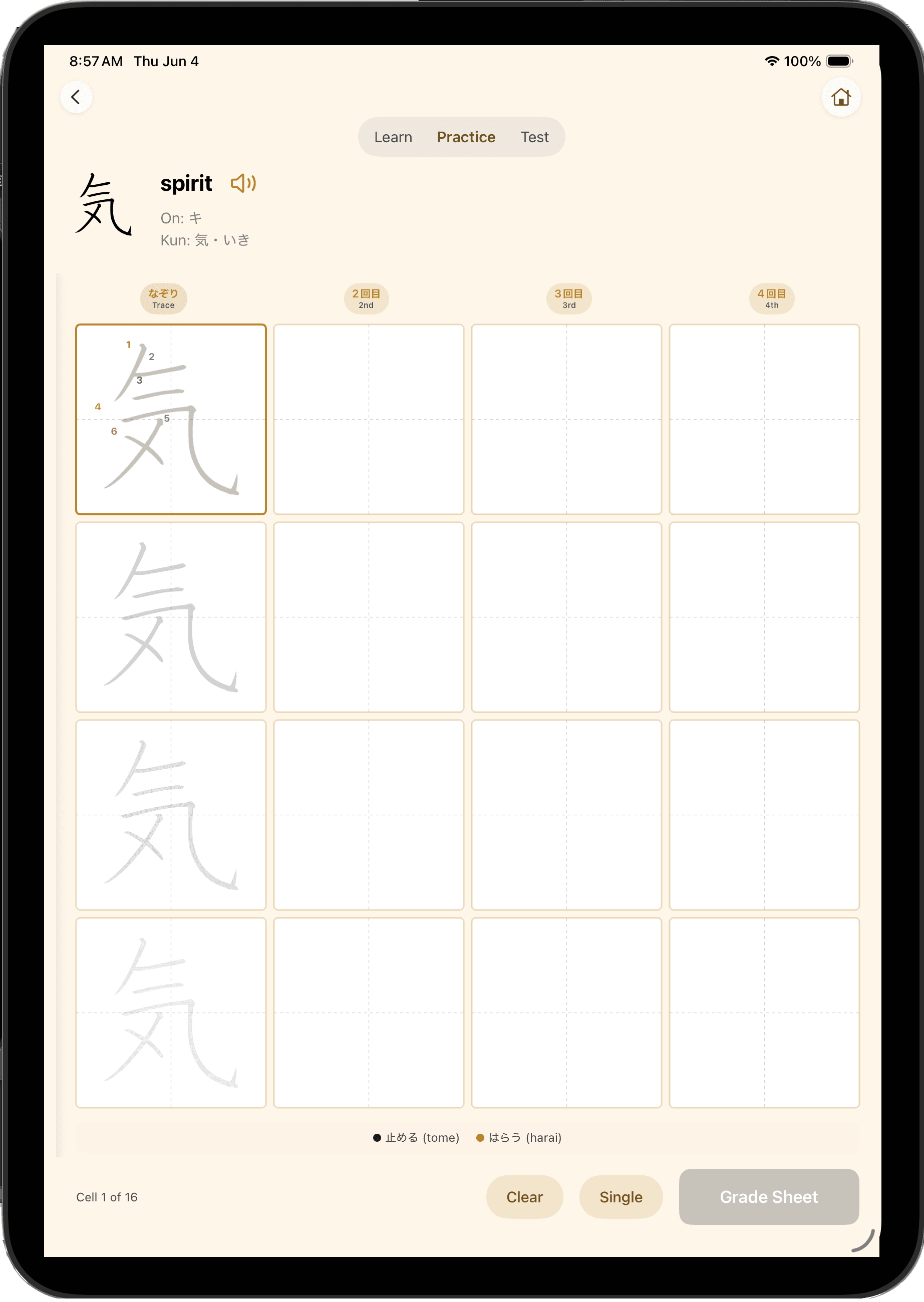
The worksheet is Practice mode at scale. Sixteen cells across four labeled columns (1回目–4回目). The ghost guide appears only in the first cell; the rest are blank. That single design decision encodes the product's teaching philosophy: you saw it once, now write it from memory.
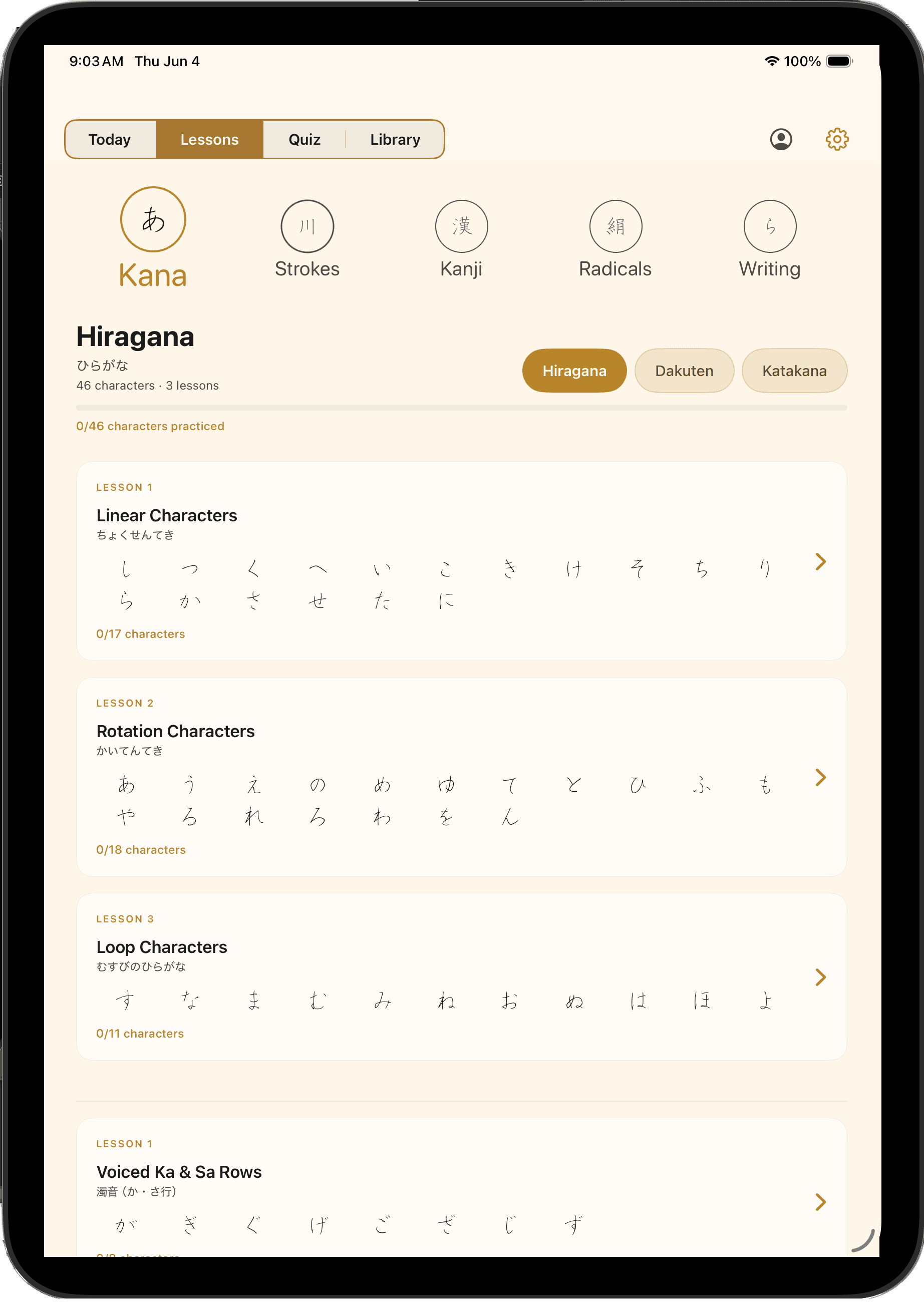
The Lessons screen organizes the full curriculum into subject areas — Kana, Strokes, Kanji, Radicals, Writing — each broken into grouped lessons with character counts and progress tracking. A student always knows exactly where they are and what comes next.
Quality, by design
Agents faithfully execute whatever system you give them (including a bad one), so quality is built into the system, not left to individual care:
- A QA gate nothing merges without passing; backend changes deploy-and-verify.
- Design tokens canonical in Swift, so design and build never drift.
- Enforced by tooling: CI, automated code review, crash monitoring, and a shared backlog.
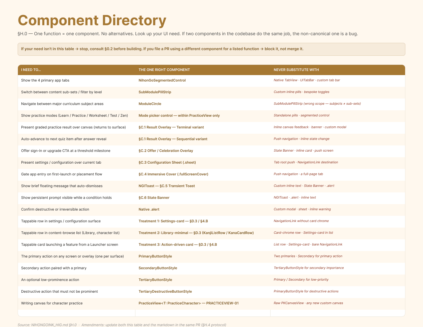
The same logic applies to the design system. The Component Directory (§H.0) is a three-column enforcement table: the UI need, the one right component, and what never to substitute. Two components doing the same job is a bug — not a style preference, not a conversation. Agents cite the relevant section in every PR; a non-canonical component blocks merge.
Tech stack
- App: iPadOS 16+, Swift, SwiftUI + UIKit (PencilKit canvas), Core Data (offline-first).
- Backend: Supabase (Postgres, auth, Edge Functions, Realtime).
- Grading (hybrid): Gemini Vision online; on-device Core ML + Vision offline, same 0–100 scale.
- Stroke & type: KanjiVG geometry; licensed embedded pen-kaisho Japanese typeface.
- Ops: Swift Testing/XCTest, GitHub Actions, Sentry, CodeRabbit, Linear; Claude Code for orchestration.
Status
Releasing to TestFlight for beta testing this summer, targeting a Fall 2026 App Store launch.
Want a walkthrough of the agent workflow, or to talk about AI-assisted product development for your team? Get in touch.